Create a Login modal popup using HTML and CSS
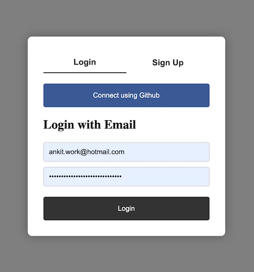
Login forms are a common feature on many websites and web applications, allowing users to securely access their personal accounts and data. One way to make the login process more user-friendly is by using a modal popup, which appears on top of the existing content and provides a focused interface for entering login credentials. In this article, we will explore how to create a login modal popup using HTML and CSS, two fundamental technologies of the web. We will cover the basic structure and styling of the modal popup. By the end of this tutorial, you will have a working login modal popup that you can use on your own website or web application.
HTML Code
The HTML code that will be used to create the Login Modal Poup is below:
<!-- HTML -->
<div class="overlay">
	<div class="modal">
		<div class="tabs">
			<button class="active" data-tab="login">Login</button>
			<button data-tab="signup">Sign Up</button>
		</div>
		<div class="tab-content" data-tab="login">
			<button class="s_btn continue-btn">Connect using Github</button>
			<h2>Login with Email</h2>
			<form>
				<input type="email" placeholder="Email">
				<input type="password" placeholder="Password">
				<button class="s_btn login-btn">Login</button>
			</form>
		</div>
		<div class="tab-content" data-tab="signup">
			<h2>Sign Up</h2>
			<form>
				<input type="text" placeholder="Name">
				<input type="email" placeholder="Email">
				<input type="password" placeholder="Password">
				<button class="signup-btn">Sign Up</button>
			</form>
		</div>
	</div>
</div>
CSS Code
The CSS code that can be used to create the Login Modal Popup is:
/* CSS */
.overlay {
  position: fixed;
  top: 0;
  left: 0;
  width: 100%;
  height: 100%;
  background-color: rgba(0, 0, 0, 0.5);
  display: flex;
  justify-content: center;
  align-items: center;
  z-index: 9999;
}

.modal {
  background-color: #fff;
  border-radius: 8px;
  box-shadow: 0px 0px 20px rgba(0, 0, 0, 0.3);
  padding: 30px;
  max-width: 380px;
  width: 100%;
  box-sizing: border-box;
}

.tab-content[data-tab="signup"] {
    display: none;
}

.tabs {
  display: flex;
  justify-content: space-between;
  margin-bottom: 20px;
  margin-top: -20px;
}

.tabs button {
  background-color: transparent;
  border: none;
  cursor: pointer;
  font-size: 16px;
  font-weight: bold;
  padding: 10px 20px;
  color: #333;
  border-radius: 0;
}

.tabs button.active {
  border-bottom: 2px solid #333;
}

.tab-content {
  display: block;
}

.tab-content.active {
  display: block;
}

.tab-content h2 {
  margin-top: 0;
}

form {
  margin-top: 20px;
}

input {
  display: block;
  width: 100%;
  margin-bottom: 10px;
  padding: 10px;
  border-radius: 4px;
  border: 1px solid #ccc;
  box-sizing: border-box;
}

button {
  display: block;
  width: 100%;
  background-color: #333;
  color: #fff;
  border: none;
  border-radius: 4px;
  padding: 10px;
  cursor: pointer;
  margin-top: 20px;
}

.continue-btn {
  background-color: #3b5998;
}

.login-btn {
  background-color: #333;
}

.s_btn {
    padding: 15px 0
}

.tab-content h2 {
    margin-top: 20px;
}
Output