Create a tab component in React
Welcome to this tutorial on creating a tab component in React. Tabs are a common UI element in web applications and can be used to organize and present content in a clear and user-friendly way.
Create a tab component in React
To create a tab component in React:
- First, create a React Hook component.
- Create a list of tabs that have click events to show the respective content for the specific tab.
- Create the content data for each tab that will be shown on a particular tab click.
- Write CSS to style the tabs and their content.
- Create a function that will show that related content on click.
In this tutorial, we will walk through the process of building a basic tab component using React, including the necessary components, state management, and event handling. We'll also learn how to style the component to make it look like a tab.
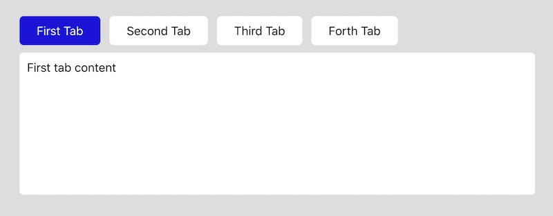
The output of the code will look like as below:
By the end of this tutorial, you will have a solid understanding of how to create your own tab component in React and be able to use it in your own projects. Let's get started!
Tabs.js
import React, { useState } from 'react';
import './css/tabs.css';

const Tab = () => {
  const [activeTab, setActiveTab] = useState(1);

  const handleTabClick = (id) => {
    setActiveTab(id);
  };

  return (
    <div>
        <ul className="tabs">
            <li className={activeTab === 1 ? 'active' : ''} onClick={() => handleTabClick(1) }>First Tab</li>
            <li className={activeTab === 2 ? 'active' : ''} onClick={() => handleTabClick(2) }>Second Tab</li>
            <li className={activeTab === 3 ? 'active' : ''} onClick={() => handleTabClick(3) }>Third Tab</li>
            <li className={activeTab === 4 ? 'active' : ''} onClick={() => handleTabClick(4) }>Forth Tab</li>
        </ul>

        <div className="tab_content">
            { activeTab === 1 && <div className="tab_panel">First tab content</div> }
            { activeTab === 2 && <div className="tab_panel">Second tab content</div> }
            { activeTab === 3 && <div className="tab_panel">Third tab content</div> }
            { activeTab === 4 && <div className="tab_panel">Forth tab content</div> }
        </div>
    </div>
  );
};

export default Tab;
You can use the above tab component in your Code:
<Tab />tabs.css
.tabs {
    display: flex;
}

.tabs li {
    display: block;
    padding: 10px 23px;
    background: #fff;
    margin-right: 12px;
    border-radius: 6px;
    cursor: pointer;
}

.tabs li.active {
    background: #1c12db;
    color: #fff;
}

.tab_content {
    padding: 10px;
    background: #fff;
    margin-top: 10px;
    border-radius: 5px;
    min-height: 190px;
}
This code example imports React and a CSS file called 'tabs.css'. It then defines a React component called Tab which has a state variable called activeTab, which is an integer. This state variable is used to determine which tab is currently active.
Inside the component, a list of 4 tabs is displayed with onClick event handlers for each tab. When a tab is clicked, the activeTab state variable is changed with the setActiveTab function. The active tab will be highlighted based on the activeTab state variable. Finally, the tab content is conditionally rendered based on the activeTab state variable.