Add box shadow to container in flutter
In flutter, adding a box shadow to a container is a simple way to make the container more visible and add some depth to the design. We can use the BoxShadow widget of Flutter to apply a shadow on the container.
How to add box shadow to container in Flutter
To add a box shadow to the Container widget in Flutter:
- First, create a Container widget.
- Then add a decoration property to with BoxDecoration.
- In the BoxDecoration create a boxShadow and customize it as per your requirements.
We can use the below code in order to do that:
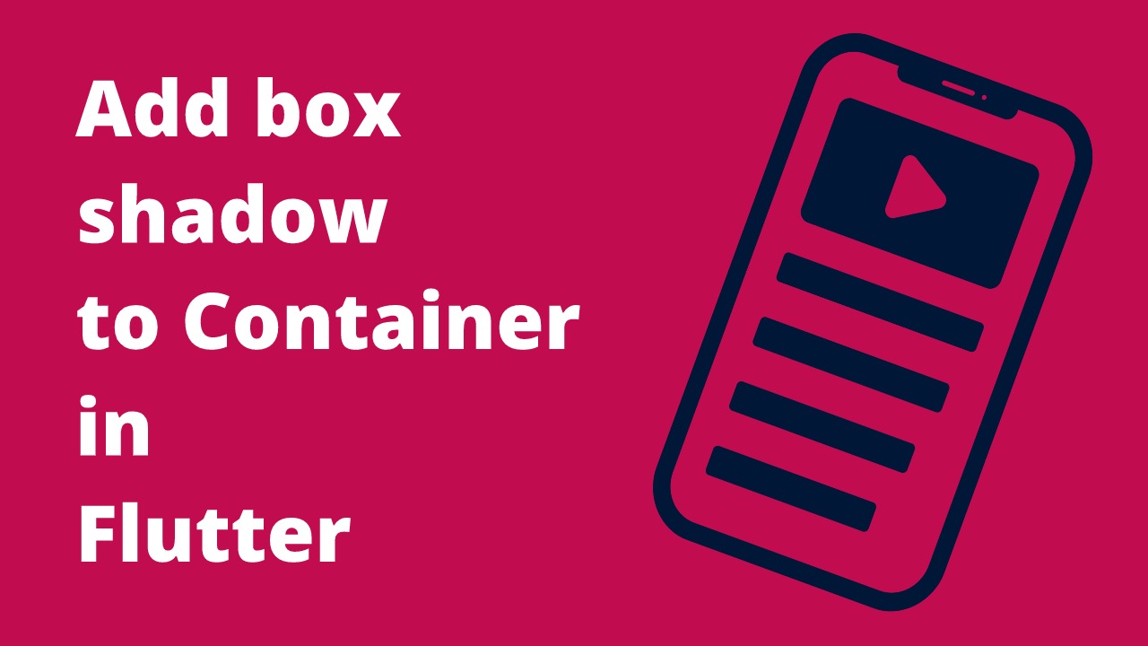
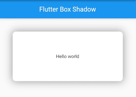
Container(
  height: 200.0,
  width: 200.0,
  decoration: const BoxDecoration(
    color: Color(0xFFffffff),
    boxShadow: [
      BoxShadow(
        color: Colors.grey,
        blurRadius: 15.0, // soften the shadow
        spreadRadius: 5.0, //extend the shadow
        offset: Offset(
          5.0, // Move to right 5  horizontally
          5.0, // Move to bottom 5 Vertically
        ),
      )
    ],
  ),
  child: const Text("Hello world"),
),
Output
Here, we are adding a box grey box shadow to the Container widget.
The code example creates a Container widget with a height and width of 200.0.
The decoration property is set to a BoxDecoration with white color and a boxShadow.
The boxShadow has a color of grey, a blurRadius of 15.0, a spreadRadius of 5.0, and an offset of 5.0 horizontally and 5.0 vertically.
The child property is set to a Text widget with the "Hello world" text.
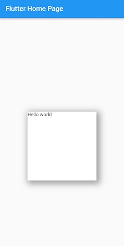
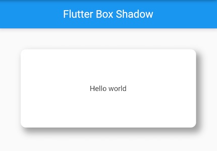
Container with a box shadow and border-radius
To enhance the design of our Container, we can use box-shadow and border-radius together. So in the below code example, we will add a box shadow to the Container along with a border radius.
If you want to read more about adding border-radius to the Container widget, you can read the below article:
Add border radius to container in flutter
Code example:
Container(
  margin: const EdgeInsets.all(40.0),
  height: 150.0,
  width: double.infinity,
  decoration: const BoxDecoration(
    color: Colors.white,
    borderRadius: BorderRadius.all(
      Radius.circular(10),
    ),
    boxShadow: [
      BoxShadow(
        color: Color(0xffDDDDDD),
        blurRadius: 6.0,
        spreadRadius: 2.0,
        offset: Offset(0.0, 0.0),
      )
    ],
  ),
  child: const Center(child: Text("Hello world")),
),
Output
Modify container box-shadow properties
Now that we have learned how to use and apply box shadow to a container, let's customize the box shadow of the container by changing its properties and making it look like your requirements.
There are four properties of the BoxShadow widget that can be used to customize the look and feel of the container.
- color: Used to change the color of the shadow.
- blurRadius: Used to soften the box shadow.
- spreadRadius: Extend the box shadow.
- offset: Shift the shadow vertically and horizontally
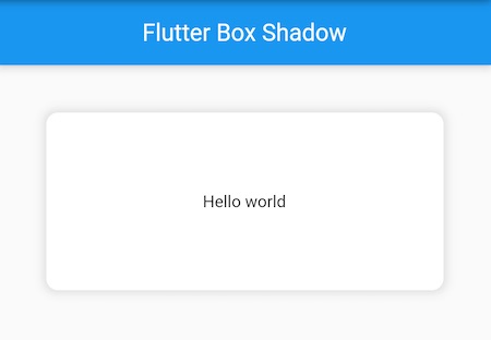
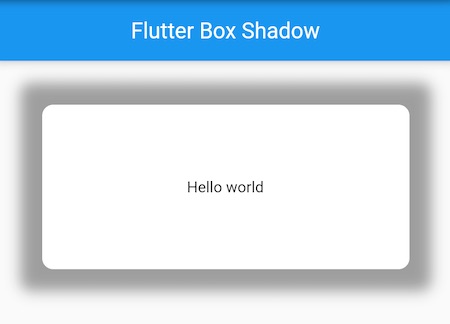
Change the color of Container box-shadow
The default value of the color for the Container box shadow is black but you can change it to any color per your requirements. You can also use colors with opacity to apply a faded look to your Container box shadow.
Container(
  margin: const EdgeInsets.all(40.0),
  height: 150.0,
  width: double.infinity,
  decoration: const BoxDecoration(
    color: Colors.white,
    boxShadow: [
      BoxShadow(
        color: Colors.deepPurple, // Change color of the shadow
        blurRadius: 15.0,
        spreadRadius: 5.0,
        offset: Offset(5.0, 5.0)
      )
    ],
  ),
  child: const Center(child: Text("Hello world")),
),
In the above code example, we have assigned a deepPurple color to our Container box shadow using color: Colors.deepPurple.
Output
Soften or blur the Container box-shadow
you can use the blurRadius property to create a soft, blurred effect. This is a great way to add some subtlety to your designs.
Container(
  height: 150.0,
  width: double.infinity,
  decoration: const BoxDecoration(
    color: Colors.white,
    borderRadius: BorderRadius.all(Radius.circular(10)),
    boxShadow: [
      BoxShadow(
        color: Colors.grey,
        blurRadius: 20.0, // Soften the shaodw
        spreadRadius: 2.0,
        offset: Offset(0.0, 0.0),
      )
    ],
  ),
  child: const Center(child: Text("Hello world")),
),
Output
Here we have softened out box shadow with a value of blurRadius: 20.0. You can assign your own value according to your requirement.
Spread the Container Box Shadow
Now let's learn how to spread the container box shadow flutter. We will use the spreadRadius property to increase the size of the shadow.
Container(
  height: 150.0,
  width: double.infinity,
  decoration: const BoxDecoration(
    color: Colors.white,
    borderRadius: BorderRadius.all(Radius.circular(10)),
    boxShadow: [
      BoxShadow(
        color: Colors.grey,
        blurRadius: 10.0,
        spreadRadius: 20.0, //extend the shadow
        offset: Offset(0.0, 0.0)
      )
    ],
  ),
  child: const Center(child: Text("Hello world")),
),
Output
In the above code example, we are extending the radius of the box shadow by 20.0. We are using spreadRadius: 20.0 for that. You can change the value and customize it further.
Move the Container box shadow - vertically and horizontally
We can use the offset property to move the shadow vertically and horizontally. Below is an example for that where we are moving the shadow 7.0 horizontally and 8.0 Vertically.
Container(
  height: 150.0,
  width: double.infinity,
  decoration: const BoxDecoration(
    color: Colors.white,
    borderRadius: BorderRadius.all(Radius.circular(10)),
    boxShadow: [
      BoxShadow(
        color: Colors.grey,
        blurRadius: 10.0,
        spreadRadius: 2.0,
        offset: Offset(
          7.0, // Move to right 7.0 horizontally
          8.0, // Move to bottom 8.0 Vertically
        )
      )
    ],
  ),
  child: const Center(child: Text("Hello world")),
),
Output
BoxShadow Widget in Flutter
A box shadow is a visual effect used in the Flutter framework that lets you add shadows to any widget. It is a built-in widget that takes advantage of the BoxShadow class.
The class allows you to create a box shadow and specify its properties such as offset, blurRadius, spreadRadius, color, and more.
There are many use cases for a box shadow. Some examples include:
- Adding a drop shadow to a Button to make it pop
- Adding a drop shadow to a Container to make it look like it's floating
- Adding a soft shadow to a TextField to make it look like it has depth
No matter what your use case is, the BoxShadow widget is a great way to add shadows to any widget in Flutter.
To use a box shadow, simply wrap the widget you want to add a shadow to with a BoxShadow widget. For example:
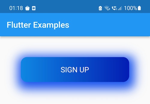
Create a button with box shadow in flutter
Container(
  height: 60.0,
  width: 300.0,
  margin: const EdgeInsets.all(50.0),
  decoration: const BoxDecoration(
    gradient: LinearGradient(
      colors: [
        Color.fromRGBO(15, 135, 226, 1),
        Color.fromRGBO(3, 29, 178, 1),
      ],
      begin: Alignment.centerLeft,
      end: Alignment.centerRight,
    ),
    borderRadius: BorderRadius.all(
      Radius.circular(15.0),
    ),
    boxShadow: [
      BoxShadow(
        color: Color(0xff1552ed),
        spreadRadius: 10,
        blurRadius: 20,
        offset: Offset(3, 7),
      )
    ],
  ),
  child: Center(
    child: GestureDetector(
      onTap: () {},
      child: const Text(
        'SIGN UP',
        textAlign: TextAlign.left,
        style: TextStyle(
          fontSize: 18,
          color: Colors.white,
        ),
      ),
    ),
  ),
),
Output
Conclusion
These were some code examples that can be used to add a box shadow to the Container widget in Flutter. We have also explained how to customize the box shadow of the Container using color, blur radius, spread radius, and offset properties. If you have also something new to contribute for the same, you can also post your code here.